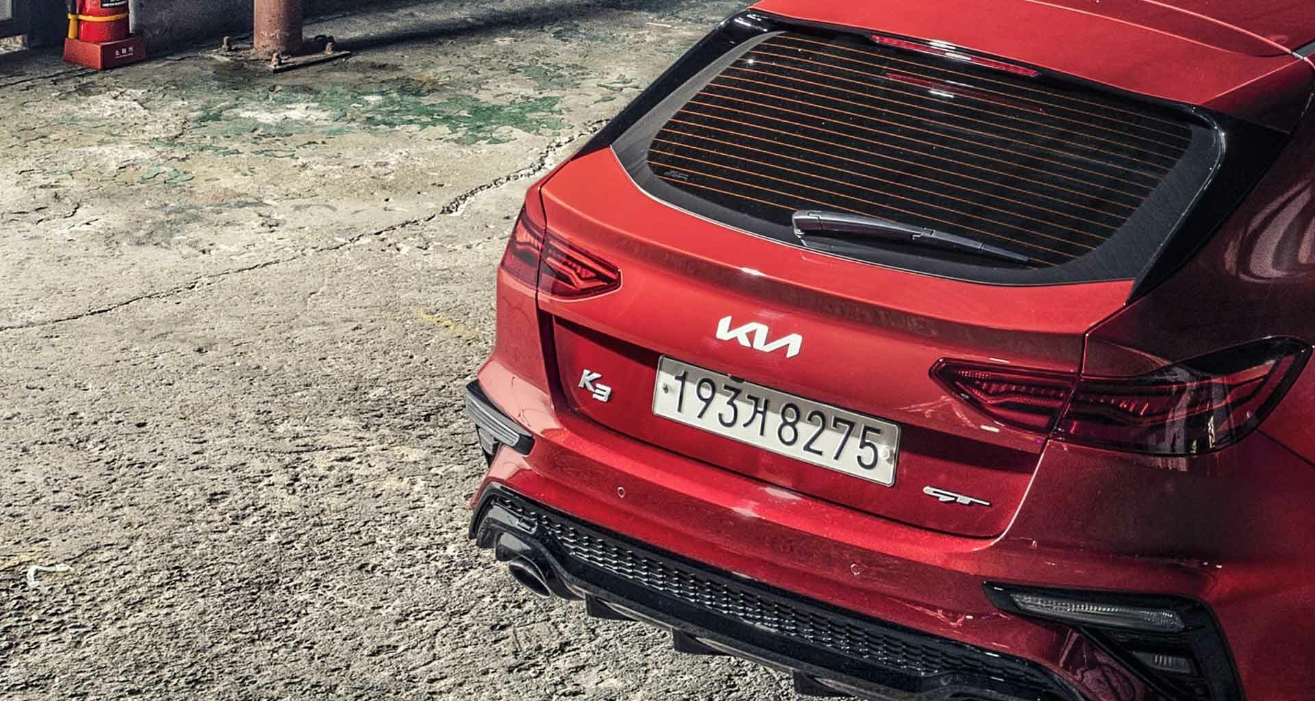
“The new 2021 logo, a brand refresh, ended up a more stylized interpretation of their name.”
I was at brunch with my son (the tall, handsome graphic designer) talking about a logo article again. He opined I wrote about logos a lot. I told him I wasn’t sure once a year qualified as “a lot.” But I’d settle for “annually.” And even then, I only wrote about logos when something happened in the brandscape that warranted comment.
Like when a brand did something egregiously fatuous. Like Bojangles and their 2020 “logo refresh,” comprised of dropping the apostrophe from their name to make it more differentiating. From what, I have no idea! Going apostrophe-less was logo-flavor-of-that-year. Papa Johns dropped their apostrophe too. “Brand refresh” hogwash like that requires comment, I opined right back.
Or when a brand does something logo-inconsequential. Like the Meta blue infinity logo Facebook said, would “future-proof the symbol,” whatever the hell that meant! I reminded my son, at the time, he noted the infinity symbol was “evocative of the past,” created in 1655 by an English mathematician named John Wallis. Graphic designers know stuff like that.
Or the actuality that some logos make bigger contributions to engagement than others. We took our 2022 Loyalty Leaders List and calculated the percent-contribution certain logos made to loyalty and profitability. Researchers know stuff like that! But let us not forget, logos are visual touchpoints – their prime-directive presenting brands in ways that makes them easily recognized and understood.
Anyway, what got me chatting about logos (this time) was an article I read about how, for the past couple of years, 30,000+ people a month were googling the “KN car.”
“’KN car,’” I thought. “What’s a KN car?”
See, when I worked agency-side, I worked on three major automotive accounts. Currently we track 22 automotive brands in our now-26th annual Customer Loyalty Engagement Index. I drive an automobile! So, I’m up on my car brands. I recognize them and, as far as their logos go, understand them. Prime-directive stuff. But the KN car? Not a brand of which I was aware. Forgetfulness? New brand? Nah.
It turns out, there isn’t a “KN” car.
But it does turn out that after 27 years, Kia redesigned their circular “KIA” logo. The new 2021 logo, a brand refresh, ended up a more stylized interpretation of their name. Brands do that. Some more successfully than others, apparently. Because the new logo is confusing the heck out of potential customers. They’re reading the logo-form of “Kia” as “KN” and searching for the latter online. Take a look here and judge for yourself with the caveat I’ve already told you what to look for.
This isn’t the news Kia (or any brand) wants to hear about their logo. Particularly a new logo. Particularly one we can reasonably presume cost a lot of money and involved a lot of planning and (even more) strategy meetings and presentations to Kia senior corporate. Brand “refreshes” generally take time and don’t come cheap, even when you’re just dropping an apostrophe or using a 368-year old symbol. And the KIA refresh was more radical than that. Considerably more. You do the math.
Anyway, you would have thought they tested various options before going full bore. I’m hoping they did something more nuanced and accurate than a thematic apperception test, or something more emotionally precise than a smiley face scale at online focus groups, or even just a Snellen eye chart to test potential car buyers’ visual acuity. Before settling on KN. Sorry, KI∧.
The Kia-confusion seems to be the missing crossbar in the ∧ or what’s supposed to be the “A.” Not a new design configuration, crossbar-less logos have been around since the 1960’s. You’d figure after all this time, designers (and researchers) were aware of possible design pitfalls – like the one where they can be mistaken for other letters – and apply more sophisticated design (and research) methodologies to avoid them. You don’t have to be a Boy Scout to be prepared. The most famous example of a crossbar-less A logo would be NASAwho successfully used it for nearly two decades. But then, they weren’t trying to sell spaceships!
BTW, the logo confusion and/or misinterpretation isn’t US-centric. Google statistics show the phenomenon is global. With would-be car buyers all over the world searching for similar terms like the “KN car,” “KN car brand,” “KN car brand price.”
If it’s any solace, Kia isn’t the only automotive brand to have logo problems.
Ford had a logo problem too a little while back. Ford’s logo has always been perfectly understandable and recognizable. The last time it was changed was 2003 and really what you could call a “brand refresh.” They changed the blue hue slightly and added a different corresponding gradient as well as 3D shading to the lettering, making it sleeker than it was before. So even more understandable and recognizable. So, what was the problem?
Because of COVID-related supply chain issues, they didn’t have enough blue oval logo badges to affix to all their cars. They were on backorder! Ford delayed delivery of vehicles because they didn’t have enough of them. Because what could be worse than a car with no logo?
Well, at the moment, what comes to mind, is a when your logo is mistaken for a brand that doesn’t exist!
Photo by Hyundai Motor Group on Unsplash.


