


Product developers and UX designers can all agree — reducing the number of steps in a sign-up flow is Product Design 101. Less UX friction translates to fewer obstacles for the end-user to overcome in order to use your product.
By Evelyn Gosnell and Kristen Berman
Behavioral “frictions” generally decrease the likelihood of a user to complete a specific task, and also account for a number of human biases. For example, our propensity to stick with the status quo and with defaults, or avoid making difficult choices, are all classic examples of the power of friction that are well supported by academic research. And companies generally get this — many product teams live and breathe this “universal truth” that friction is a bad thing that should be eliminated. Evan Willams, the founder of Twitter, has said that “if you want to build a billion-dollar internet company…identify [a human] desire and use modern technology to take out steps.”
But can friction be a good thing in some cases? These are three examples that suggest we should rethink this notion that friction is always bad. In some cases, we might even want to increase friction.
1. It’s about perceived friction, not just actual friction.
Imagine a system where there are very few steps (low logistical friction), but at first glance, it looks like a lot of effort (high psychological friction). In this world, it is worth considering whether we should decrease the psychological friction, even if it means increasing the logistical friction.
Let’s take an example from Ethan Smith, Growth Advisor at MasterClass, an online learning platform. Like many other products, MasterClass originally asked users for their email and credit card on a single screen.
MasterClass then tested separating the email field and credit card fields onto two different screens, which is in direct contrast to design ‘best practices’ that recommend fewer steps is better due to the extra click required (see images below).
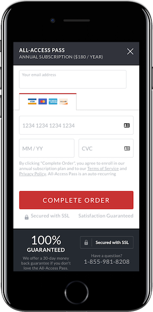
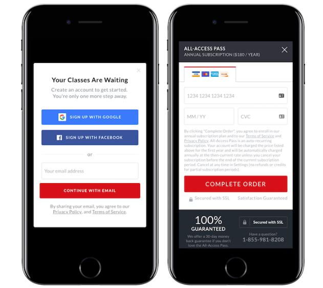
What MasterClass found, however, was a substantial increase in subscriptions, which is potentially attributable to the idea that even though the number of steps increased, the perceived level of “ask” on each step was reduced.
Goodui.org has reported similar results. Goodui.org is a platform that aggregates experimental results across different contexts, providing members with insights into effective design techniques. In the images below you can see their two-condition experiment: one condition has all of the sign-up fields on one page, and the second condition breaks up the fields onto two pages.


Like MasterClass, the number of steps increased, but the amount of information collected stayed the same. And like MasterClass, doing this increased conversion (8.7% to 11.7%). Goodui.org includes this example in a series of five tests that all examine the effect of splitting up steps into multiple screens. Based on these five tests, they conclude that splitting up steps is a winning strategy that will likely increase conversion, with a 5.5% median effect.
A third example comes from Trunk Club, a clothing subscription service. To increase the number of site visitors that sign up for its service, Trunk Club tested a change to its sign-up flow. The new flow added more steps but allowed the user to focus on each question individually, with visuals supporting each question. Launching this experiment was a risk; the longer flow increased the number of opportunities a user had to drop out of the experience. However, the experiment results showed that the longer flow increased conversion by 133 %.
In these examples, people became more motivated to continue when there were more, not fewer, steps. Ethan Smith explains:
Contrary to ‘best practices,’ adding more steps to a flow often does not reduce conversion. In fact, it can increase conversion. Users tend to focus on the current screen and the immediate decision of whether to continue or exit. They perform cost-benefit analyses for each step. By reducing steps on each individual screen and separating them into more screens with fewer steps, the user perceives a reduced cost on each screen. This seemingly small change in the cost-benefit equation can lead to dramatic increases in conversion.
It might be the case that there is a difference between actual friction and perceived friction. Breaking fields up into multiple steps does not allow people to fully consider all of the future costs in their decision making. They evaluate only one cost at a time.
2. Friction can increase conversion by changing someone’s mental model.
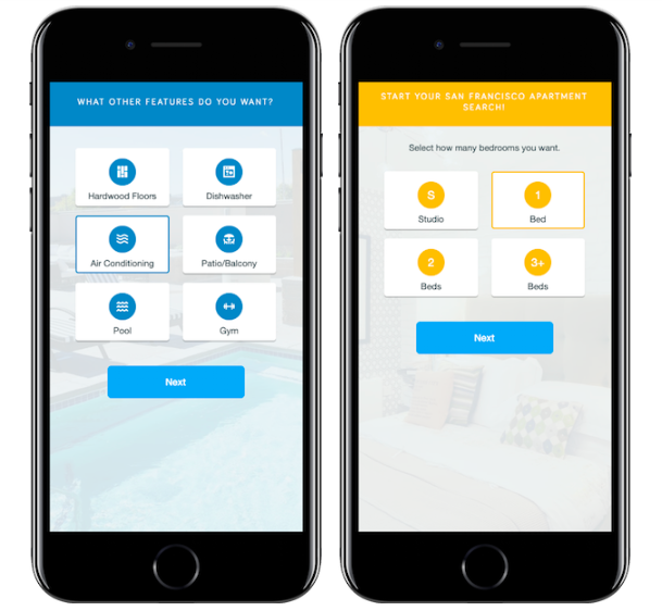
Smith shares an example from Apartment List, an online apartment rental marketplace.
Apartment List increased conversion by adding relevant and easy to complete steps in their sign-up flow (e.g., asking a user looking for an apartment how many bedrooms they need, their price range, and which features they want). While these additional questions increased friction for the user, these questions show the customer the potential benefits they will receive if they complete the flow. This change in the perceived benefit changes the cost-benefit equation resulting in dramatically more users finding their new home.
This approach is currently being used at other companies. StitchFix is a subscription personal styling service. Given StitchFix’s relative newness to the market, it may be unclear how the service works and what benefits it can offer potential customers. To mitigate this, StitchFix asks questions in its sign-up flow that clarify the benefits the service can provide. For example, as shown below, they cleverly highlight multiple benefits by asking “What are the reasons you’re excited to try StitchFix?”

StitchFix also asks users if they want help with outfits for work, casual, or date nights. Without this question, users may assume StitchFix only handles one type of wardrobe — i.e., the business dress.
3. Friction slows users down, and sometimes that’s a good thing for how they make decisions.
Instagram has recently been in the news for testing an anti-bullying feature. If someone types a mean comment, he sees a prompt to reconsider before posting. According to Instagram, early tests have shown that this prompt does effectively get some people to reconsider. That is the nature of friction; it can create moments of pause where the user gets to reflect. In Instagram’s case this caused people to realize they might not actually want to proceed. In other cases, it can help users think differently about whether they want to sign up for a product; it can change their commitment.
Let’s dive into some sign-up flow examples, starting with Secret Escapes, a flash-sale travel company that offers discounted rates on 4–5 star hotels. Before launching their app, their internal team was conflicted about whether to allow users to see the travel deals without signing up (inputting their email and password). To test this, they ran an experiment. In the first condition, users were able to close or skip the sign-up screen. In the second condition, sign-up was required and no skip option was offered. The second condition, that forced users to sign-up, was the winning condition. It doubled the sign-up rate without negatively impacting reviews.

OKPanda observed a similar finding. People completed more language learning sessions when they were required to put down a credit card to activate the one-month free trial than those who were not asked to put down a credit card to activate it. Founder Adam Gries believes this was due to helping people actively commit to trying out the product. People who experienced no friction never fully committed to their free month.
Friction is complex. While most of the time, friction might prevent certain behaviors, companies are telling a more nuanced story. In this case, we show that some companies have found friction may be “good” if it serves to 1) decrease the perception of costs 2) increase attention to future benefits or 3) increase the likelihood of commitment.
The bottom line is that decision-making is complex. It’s time to break the universal rule that friction is a bad thing, and add some nuance to it. Are there instances where you should be adding friction to your product flow?
This article originally appeared on Irrational Labs. Apply here to Irrational Labs’ Behavioral Economics Bootcamp.
Photo by Sandeep Singh on Unsplash.